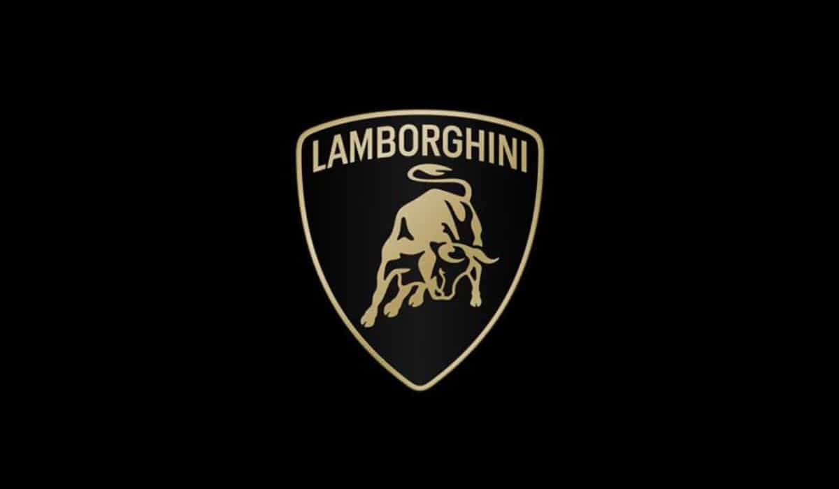
Lamborghini has unveiled its new logo, which has undergone subtle changes while retaining the essence of the raging bull, now slightly revised.
“After more than two decades, we have refreshed our historic logo,” the brand announced regarding its new logo, which will be applied not only digitally but also on actual cars, likely starting with the successors to the Huracan and the Urus plug-in hybrid.
The main change lies in the slight enlargement of the “Lamborghini” typography, while black and white remain as primary colors, complemented by shades of yellow and gold. The brand also plans to use the iconic bull without the shield in its online media.
Furthermore, Lamborghini aims to incorporate a minimalist and bold aesthetic into the new logo, aligning with the angular design language of its supercars and SUV. According to the brand:
“The restyling aims to adapt the brand’s visual expression to the “bold”, “unexpected”, and “authentic” values of our mission ‘Driving Humans Beyond’. It is part of an ongoing evolution process, initiated with our Direzione Cor Tauri strategy, which aims to implement changes that involve not only our super sports cars but also our entire corporate identity.”
This move is part of a broader strategy that includes the introduction of new models, such as an EV scheduled for 2028 and a fully electric second-generation Urus.
Despite Lamborghini’s growing success, with deliveries surpassing 10,000 units for the first time in 2023, demand for existing models such as the Huracan and Urus already exceeds supply until the end of production, while new orders for the Revuelto will not be fulfilled until 2026.
Source: Motor1.com and Lamborghini
Ver essa foto no Instagram

